Your About page might be the most misunderstood asset on your entire site.
Most businesses treat it as a digital brochure — a place to dump their history, list their awards, and pat themselves on the back. But that’s not what visitors want. Not even close.
By the time someone reaches your About page, they’ve already made a series of micro-decisions. They clicked past your homepage. They glanced at what you offer. Now they’re trying to figure out whether you’re the real deal. What they’re really asking is simple: should I trust you?
This is a pivotal moment in the buyer’s journey, and wasting it is a costly mistake.
If you run a web design company or work as a solo website designer, this page carries enormous weight for your business. It routinely lands in the top five most-viewed pages on professional service sites. Below is a section-by-section blueprint that turns casual browsers into confident prospects.
Make the Visitor the Opening Character
The default opening for most About pages is a company origin story. That’s almost always the wrong move.
Consider this: “XYZ Creative was founded in 2014 with a passion for bold design.” It tells the reader you exist. It doesn’t give them any reason to care. You haven’t addressed their needs or demonstrated awareness of their world.
Flip the script entirely. Begin with a statement about the problem your audience wrestles with. A website designer might write: “You need a site that converts visitors into paying customers — not one that just looks impressive in a portfolio.” That opening immediately tells the reader you understand what keeps them up at night.
A strong introductory paragraph needs only two things: an acknowledgment of the visitor’s challenge and a clear signal that you have the answer. Everything else — your credentials, your story, your philosophy — follows naturally once you’ve earned their willingness to keep reading.
Speak to the Three Silent Questions
Every person who lands on your About page is running a mental evaluation. Whether they realize it or not, they’re weighing three things:
- 1.Do you have the skill to deliver?
- 2.Have you already done this for someone in my shoes?
- 3.Can I imagine working with you?
Build your page structure around these three checkpoints. Each one deserves its own focused section.
Show Evidence of Competence
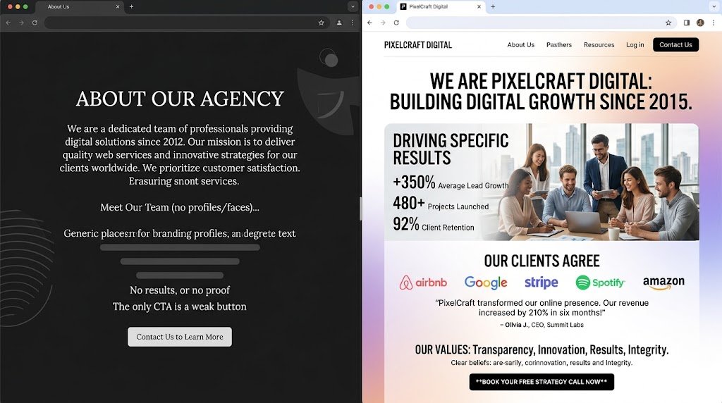
This is where vague language kills credibility. Statements like “we bring creativity and passion to every project” sound like they were generated from a template. Because they were.
Replace abstractions with proof. A website designer working in the hospitality space might say: “I’ve designed over 60 websites for boutique hotels and vacation rentals across three countries.” That sentence accomplishes more than an entire paragraph of adjectives. It gives the reader something concrete to evaluate. If your numbers aren’t large yet, specificity about your focus area still wins. “I build Webflow sites exclusively for independent bookstores” communicates clear expertise without inflating anything.
Connect With Their Specific World
A financial advisor and a fitness coach need radically different websites. Your About page should make it obvious which world you belong to and that you understand its nuances.
Name the fields you work in. Reference the kinds of problems those professionals face. When a web design company that serves nonprofit organizations states that directly, the executive director reading the page exhales. She thinks: these people speak my language.
You don’t need elaborate case studies here — that’s what your portfolio or blog is for. But a single outcome statistic adds weight. “Organizations we’ve partnered with have seen an average 35% increase in online donations.” One specific claim, stated plainly, carries more persuasive power than a dozen generalized promises.
Reveal the People Behind the Brand
This might sound rudimentary, but the gap between acknowledging that personal connection matters and actually implementing it on your About page is enormous. Browse through a dozen competitor pages and notice how few feature genuine human imagery or voice.
If you’re a solo operator, show your face. Pick a photograph that represents who you actually are — not a generic stock image, not an overly polished corporate shot. Something that says “this is a person I could have a real conversation with.”
For teams, display the group. Names matter. Roles matter. Even a single descriptive line adds dimension: “James, our UX specialist, spent eight years in healthcare before switching to digital design.” Details like this transform an abstract entity into a collection of real individuals. And real individuals are inherently more trustworthy than faceless brands.
Tell Your Origin Story — Strategically
This is where your founding narrative earns its place. It belongs in the middle of the page, not at the top. Stories are among the most powerful tools for creating connection. But they need editing.
Skip the chronological rundown of every milestone. Focus instead on three elements: the catalyst, the conviction, and the continuity. Why did this venture begin? What belief drives it? And how does that belief show up in daily practice?
Here’s a strong example: “I started this practice after watching too many talented consultants lose clients to competitors with better-looking websites. Every project we take on now prioritizes clarity and performance over decorative flourishes.” That story works because it doesn’t just describe the past — it explains the present. The reader walks away understanding your priorities.
If your history doesn’t actively serve the reader’s decision-making process, trim it. Nobody needs a detailed account of your office relocation or your 2020 rebranding initiative.
Define What You Won’t Compromise On
A brief section on your operating principles does something most marketing copy cannot: it simultaneously builds authority and repels the wrong fit.
Imagine you’re a website designer Singapore who insists on conducting thorough user testing before any launch. Put that in writing. It establishes that you follow a rigorous process, and it attracts clients who value thoroughness. The bargain hunters who want the fastest, cheapest option will self-select out — a result that saves everyone considerable friction.
Two or three sharply stated convictions outperform a long list of soft values. “We believe in excellence and integrity” evaporates from memory the moment someone reads it. “We’ve turned down projects where the client wanted to mislead visitors, and we’d do it again” makes an impression that lasts.
Give the Visitor a Clear Path Forward
Without a defined call to action, even the most compelling About page becomes a road that leads nowhere. The visitor has spent several minutes learning about you. Their interest is at its peak. Don’t leave them stranded.
Pick one next step and present it without ambiguity. “Schedule a consultation” or “See our recent work” both function well. The right choice depends on how your sales process typically unfolds. Whatever you choose, the visual cue should be prominent and immediate.
For a web design company, a portfolio link often makes the most intuitive sense. After reading your story and values, the natural next question in a prospect’s mind is: show me what this looks like in practice.
Quick Refinements That Make a Difference
Speak directly. First person — “I” or “we” — reads as authentic. Third person corporate language reads as distant. Choose the voice that sounds like a real human being.
Test the rhythm. Read your copy at a natural speaking pace. Awkward phrasing becomes obvious the moment you hear it. Smooth out every rough spot.
Refresh regularly. An About page that references outdated team sizes, old service offerings, or stale statistics undermines the very trust it’s meant to build. Mark your calendar for biannual updates.
Audit for generic sentences. Take each line and ask whether a competitor could publish it unchanged. If the answer is yes, it’s not earning its place. Rewrite until every sentence could only come from you.
Wrapping It All Up
The purpose of your About page is not self-celebration. It’s answering one essential question from the visitor’s perspective: what do I need to know before I trust you?
Prove your expertise through specifics. Show that you’re a real human being. Then make it effortless to take the next step. Those three principles alone will put you well ahead of the competition — regardless of their budget or size.
Pull up your About page now and review it through this lens. You’ll likely spot several opportunities to strengthen it, and each one matters more than you’d expect.