Traffic may reach your site while enquiries stay quiet. The form functions, contact details are present, and services are listed somewhere. So why does interest fail to become a response?
The homepage is a good place to look first. It can look polished while leaving visitors unsure about your offer, your suitability, or their next step.
A conversion could be a call, booking, purchase, or form completion. Whatever the goal, the page should make progress easier. A useful review checks whether the page supports that step at each stage. The ten faults below show where that progress often breaks down.
1. A Headline That Could Fit Any Organisation
“Committed to Excellence” could appear on a physiotherapist’s site, a roofing company’s page, or a software provider’s homepage. The line gives visitors no useful anchor.
The opening heading should explain what you provide and whom you serve. Nielsen Norman Group’s homepage guidance recommends stating the organisation’s purpose through a clear tagline.
Imagine a fictional music school. Replacing “Inspiring Every Learner” with “Weekly Piano Lessons for Beginners in Chester” immediately sets expectations. Personality can coexist with precision, but visitors should not need to decode your offer. Ask someone outside the business to read the top section and describe what you sell.
2. Several Actions Competing for Attention
A homepage may invite quote requests, service browsing, newsletter sign-ups, article reading, and social follows. Trouble begins when every option carries the same visual weight.
Decide which single action best serves someone considering your business. For a mobile locksmith, that might be booking a callout. For an online shop, it could be browsing a product category. A web design company can help identify which option deserves the strongest visual weight.
Secondary choices can remain available through quieter links or less prominent buttons. The primary action should still be obvious at a glance. Button wording matters as well. “Book a Locksmith Callout” explains the next step more clearly than “Discover More.”
3. An Opening Screen Filled by Imagery
A large photograph can set a mood well. It can also fill a phone screen without explaining the business.
Picture a pet-grooming site opening with a full-screen image of a trimmed dog. A logo, menu icon, and the phrase “Care in Every Detail” appear. Whether the service handles anxious animals, show breeds, or routine appointments remains unclear. A website designer should check how the image behaves on a small handset.
Keep key details visible beside the image: the offer, a suitability clue, and a clear next step. The opening screen does not need to contain everything. Give people enough context to see why reading further matters.
4. Copy That Starts With the Company
Company history can matter when experience affects a buying decision. A long introduction about the founding year may delay information a prospect needs. Visitors often arrive with a specific task in mind.
Someone with a damp wall probably wants your service area, availability, and the types of surveys you offer. Read each paragraph and ask what decision it helps a visitor make. “We take pride in our work” offers little practical guidance. “We survey residential properties across north Cardiff” gives useful direction.
Keep company background where it supports a decision. Let the opening sections answer the questions that brought people to the page.
5. Claims Without Nearby Evidence
“Trusted,” “skilled,” and “high quality” are easy words to publish. Visitors still need reasons to accept them.
Place supporting material near each claim. A decorating firm could show completed rooms with property details and scope notes. An independent consultant might list qualifications and provide documented case examples. A web design company can help decide which proof points deserve prominence.
Specific evidence gives people something to assess. A written project summary explaining the work tells visitors more than an uncaptioned gallery. Handle logos, awards, and review scores carefully. A small amount of verifiable proof is more useful than a crowded row of badges with unclear meaning.
6. Mobile Layouts That Make Tasks Awkward
Open your homepage on a phone and try to submit an enquiry with one hand. Is the text readable? Does the menu open correctly? Can you tap the intended button without hitting its neighbour?
Does a chat widget cover part of the form? A layout built for a large monitor can become frustrating on a smaller screen. Text may overlap images, and floating elements may block controls. Ask a website designer to walk through the enquiry journey on a real handset.
Test the whole task, including typing into fields and reading the confirmation message. This matters especially if most customers contact you by phone.
7. Pages That Keep Visitors Waiting
A delayed opening section can interrupt a simple visit. So can an image that appears slowly or a button that shifts as someone taps.
Check what loads first. A decorative video may postpone the content people came to read. Oversized images and unnecessary third-party widgets deserve similar scrutiny. A web design company can help separate design choices from hosting problems.
The aim is to make essential content and controls available quickly. A plain opening section often serves visitors better than an elaborate animation. Test outside the office network. Open the page on a phone using mobile data, then use a performance tool to examine what you notice.
8. Basic Buying Information Is Hard to Find
Visitors rarely need a full proposal before making contact. They do need enough detail to judge whether an enquiry is worthwhile. Clear facts reduce uncertainty before contact.
Depending on the business, that might include service areas, minimum order quantities, typical project scope, or delivery arrangements. If exact costs depend on the job, explain what affects the total. A starting figure or representative example can help when accurate and clearly qualified. You do not need to publish every detail on the homepage.
Provide a brief answer and a descriptive link to the relevant page. Hiding all practical information behind “Contact us to learn more” asks visitors to commit before they know whether you can help.
9. Enquiry Forms That Ask for Too Much
A visitor wants to ask whether you can help. Your form requests a job title, full address, company size, budget, and preferred appointment date.
Some details may be necessary. Others could wait until you reply. W3C’s form guidance recommends requesting only information needed for the process. It also warns that excessive or irrelevant questions can contribute to abandonment.
A website designer should review each required field and identify how the answer is used. If nobody needs it to respond meaningfully, consider removing it or making it optional. Explain unfamiliar fields and show clear instructions when something goes wrong. After submission, confirm that the message was received and describe what happens next.
10. Pop-Ups That Interrupt Early Exploration
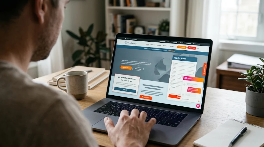
A visitor arrives and immediately sees a newsletter invitation. After closing it, a promotional banner appears. Meanwhile, a chat window expands over the service description. The visitor has not yet had a chance to read anything.
Each feature may have a purpose. Together they can make the homepage difficult to use. Review the page as a complete experience. Consider when an invitation becomes relevant and how much space it occupies.
A web design company can assess whether prompts appear at sensible moments. Check the combined effect on mobile, where space is limited. A discount prompt may help someone preparing to buy. The same prompt can be premature for someone still learning what you sell.
Begin Where Visitors Get Stuck
These warning signs are useful places to investigate. They do not prove why a particular website is underperforming. Traffic quality, the offer, and market conditions also influence enquiries.
Start by watching someone unfamiliar with your site attempt a real task. Ask them to find a suitable service and make an enquiry. A website designer can help interpret where they hesitate or search for missing information. Fix the clearest obstacle first, then review what changes.
A clearer headline, a shorter form, or a more usable mobile layout may resolve the issue before a complete redesign becomes necessary.